PROBLEM
Netflix users often feel overwhelmed at the magnitude of content they can choose from - they feel lost in a sea of contents which is, currently, inadequately addressed by the numerous and unreliable recommendations on Netflix.
solution
Key outcomes:
Implementation of an External Ratings function (IMDB / Rotten Tomatoes)
Addition of a Social Media Function within Netflix
Ability to share content recommendations between friends
Ability to view friends’ recently watched / rated lists
ResearCH
With this project stemming from a personal pain point of mine, I wanted to see if anyone else also faces the same problem as me. If so, I wanted to really understand why it’s overwhelming, when people feel overwhelmed, and how people currently deal with this issue.
primary + secondary research
Research Methods Used
competitive analysis
Netflix is the industry leader
I researched the top competitors in the industry & found that Netflix’s interface is actually the simplest & easiest to use.
Other services provided options of paid & free content and limitations of available content which increased the complexity of decision-making process.
Surveys
In order to really understand Netflix users’ behaviours and thoughts about the platform, I carried out 8 one-on-one interviews and collected 58 responses from my survey. Below are some of the responses from them:
“Netflix recommendations are hopeless.”
“It’s too overwhelming - there are too many selections and I end up wasting time endlessly browsing and not watching anything.”
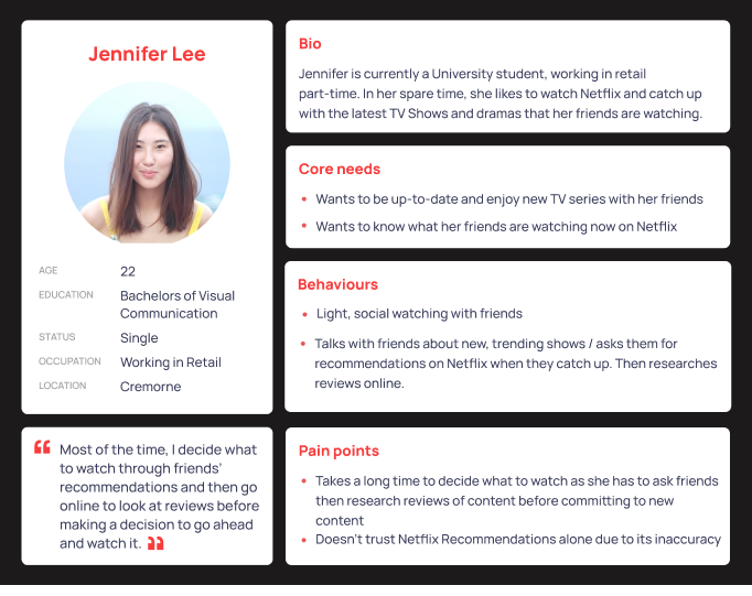
“Most of the time, I decide what to watch through work colleagues’ / friends’ recommendations and then go online to look at reviews before making a decision to go ahead and watch it.”
1-on-1 user interviews
gathering insights & themes
I collected insights from surveys and one-on-one user interviews conducted with a view of collating and categorising them into themes and ideas, creating an affinity map. This process assisted me to locate patterns and pain points of users in their experience whilst using Netflix.
Importantly, it was evident that users were frustrated with institutional indecisiveness during the content browsing and selection process derived from inaccurate Netflix recommendations.
Also, users exited the Netflix platform to seek factors such as online ratings & reviews via Google research and asked friends for recommendations to help them in their content selection process.
key insights
Main Themes & Ideas from Research
Overall, based on the trends from my affinity map, majority of Netflix users will seek sources outside of Netflix to decide what to watch, usually based on their friends’ recommendations or online ratings & reviews.
There was a consensus in the users’ frustration in regards to the Netflix’s algorithmic recommendations as inaccurate, leading to unreliability of Netflix recommendations.
Majority of users feel overwhelmed by the large library of options available on Netflix and hence, find the “browsing content” process to be the least enjoyable experience whilst using Netflix.
persona
After strengthening my understanding of the users through the Affinity Map, I created the personas, Harris Stevenson, a full-time worker and Jennifer Lee, a University student. They represent a large portion of Netflix users who live a busy lifestyle and enjoys Netflix as a form of entertainment.
customer journey map
This Customer Journey Map portrays Harris and Jennifer’s experience.
Importantly, both Harris and Jennifer’s major pain points lie in the preliminary stages of their journey - the browsing content steps of their journey.
Main pain points:
Overwhelming amount of contents to choose from
Hassle to exit Netflix and research further content information (e.g. reviews/ ratings)
Hassle to exit Netflix to ask friends for recommendations
how might we?
Ideate
I brainstormed ideas by myself through Crazy 8’s , placed ideas on an MVP matrix and also brainstormed ideas with a group of my peers. In the group brainstorming activity, shown below on the right, each person voted on which ideas they believed would be the most effective. These votes are represented by the black dots on the right figure.
Crazy 8’s
MVP matrix of ideas from Crazy 8’s
Dot voting for best ideas from group brainstorming activity
After refining ideas from both myself and my peers, I decided on the top 3 most effective ideas to help users in their content selection process:
External ratings (Rotten Tomatoes / IMDB)
Share recommendations between friends
View content that friends have “Recently Watched / Rated”
first sketch
Low-Fidelity Wireframes
1. External ratings (Rotten Tomatoes/ IMDB)
From surveys and user interviews, I found that many users searched ratings and reviews of content before committing to watch it so this was an important feature I wanted to include within the Netflix platform, to save time and effort for users to search ratings and reviews outside of Netflix.
2. Share recommendations between friends
Based on survey results, 37.9% of users currently find content to watch by asking their friends / peers for recommendations. A large number of users are communicating outside of the Netflix platform, either in-person or messaging online to receive recommendations from their friends. To make this process easier and more efficient for the user, I implemented this idea to share and receive recommendations between Netflix users directly within the Netflix platform.
3. View content that friends have “Recently Watched / Rated”
Gathering insights from one-on-one interviews, I have found that users often ask their friends what they have recently watched and / or enjoyed watching. Similar to the sharing recommendations feature, I have continued to incorporate the social media function on Netflix with a new feature to view content that friends have “Recently Watched / Rated”.
testing + iteration
2 major improvements on my lo-fi wireframes
Based on feedback from my 7 user participants on my low-fi wireframes above, I made 2 major improvements.
1. Less clicks
In order to reduce clicks for users and incorporate the social aspect of Netflix users more seamlessly, I combined the two screens from my wireframe screens below of sharing content to a Netflix user into one by listing Netflix users at the top of the screen and showing options of sending content to users outside of Netflix underneath as shown in the High-Fidelity Prototype Version 2 .
2. Easier visibility
For users to easily and quickly view recommendations from their friends, I combined the list of friends with their recommendations together. Previously, the “My Community” Page in my wireframe screens on the left below showed these sections separately but through combining them in my high-fidelity prototype on the right, users are able to easily view their list of friends on the left column and their respective recommendations on the right.
after 1st iteration
High-Fidelity Prototype
I used Figma to re-create the existing UI of Netflix and incorporate the feedback received on my low-fidelity prototypes with the use of colour and fonts to seamlessly adapt to the Netflix brand.
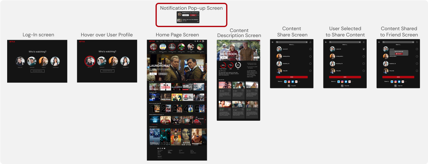
The below prototype shows the revamped log-in page and introduces the social media platform, by showing notifications of friend requests. Furthermore, the user flow demonstrates the sequence of the function for the user to share content to their friends via the ‘Share to a Friend’ feature.
A ‘Favourites’ system is also introduced where users are given the ability to prioritise which Netflix categories they encounter, so as to give them power to customise recommendations made by the Netflix algorithm.
The below prototype is a continued incorporation of the social media function on Netflix.
It introduces profile pages of friends which the user can toggle to view their friends’ recently watched, recently rated and alphabetical contents they have viewed. Users can also add friends or cancel friend requests. On this profile page, users are able to send recommendations to a friend by selection from a library of contents or by searching content title.
Further, it introduces the ‘My Community’ page, which acts as a hub to show all of the user’s friends and the friends’ recommendations received by the user.
2nd testing + iteration
Key Insights on 2nd Usability Testing
Testing my High-Fidelity prototype as an interactive prototype really helped me to understand users’ behaviours and allowed me to see what was natural for exisiting Netflix users.
Overall, users were able to navigate & successfully complete all given tasks smoothly.
All users found the external ratings feature very useful and efficient as they already research ratings outside of Netflix separately.
Similarly, users found the features of sharing and receiving recommendations with friends very helpful.
Majority of the users viewed content shared by their friends through notifications at the top of the navigation bar.
A few users were confused about the location of friends’ “Recently Watched / Recently Rated” feature but ultimately navigated successfully.
To minimise users’ actions and increase content visibility and furthermore address confusions, slight iterations were made:
Prototype Version 2 now allows the user to see their friends’ “Recommendations”, “Recently Watched” and “Recently Rated” in the main “My Community” page, where it was previously available on the profile pages.
The Final Product
Click here to see the Final Product
metrics of success
If I could implement my design ideas, how would I measure its’ success?
Increase in retention rate of users
High frequency in use of the added features (external ratings, sharing recommendations between friends & friends’ recently watched / rated)
High levels of interaction between users via the newly added social media platform
Shorter length of time for users to choose content to watch
Higher length of time of users staying on the Netflix platform
Decrease in any signs of frustration of users on the browsing process of the platform through recordings of their use
with more time & resources,,,
Limitations & Next Steps
Given the limited time and resources allocated to this project, the scope was somewhat limited to only address the most eminent pain points experienced by the users.
With further time and resources, the next steps could be:
Incorporating a “newsfeed” in My Community function, where more complex features such as liking or commenting on a friend’s activity are available (i.e. their recently watched / rated)
Embedding in the content description page comments and ratings given by the user’s friends
Transcription of the same changes to other devices on which Netflix is available (e.g. smartphones, tablets and Smart TVs)
conclusion
Reflections & Improvements
This project posed significant challenges, such as the following:
Adapting a social media system within a content streaming platform without shifting focus on the primary function of Netflix
Implementing a social media function in the current existing UI of Netflix
Through this project, I was able to develop skills necessary to design a UX journey within a confined boundaries set by Netflix’s current UI. This included being aware of the commercial goal of Netflix and minimising the deviation from its current state of operation to ensure user familiarity. Further, in a visual design aspect, I developed skills of adapting new features so as to assimilate the visual aspect of the social media platform to deliver a seamless customer journey.


